|
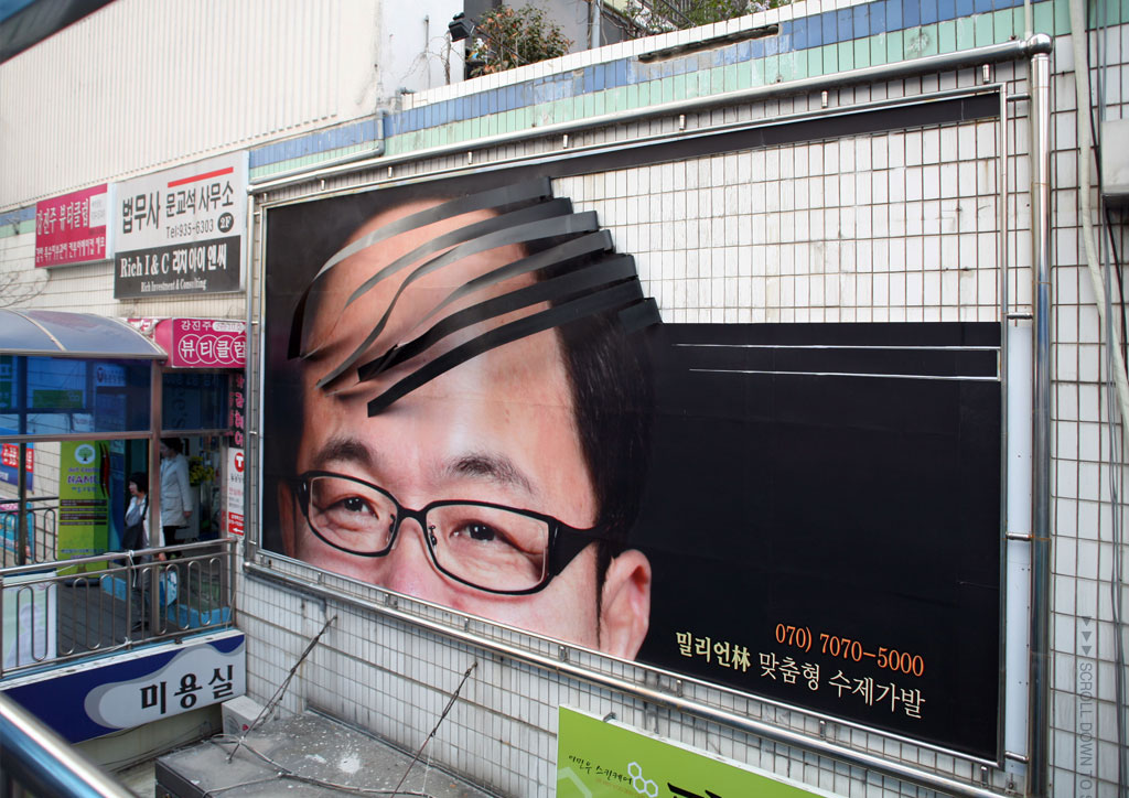
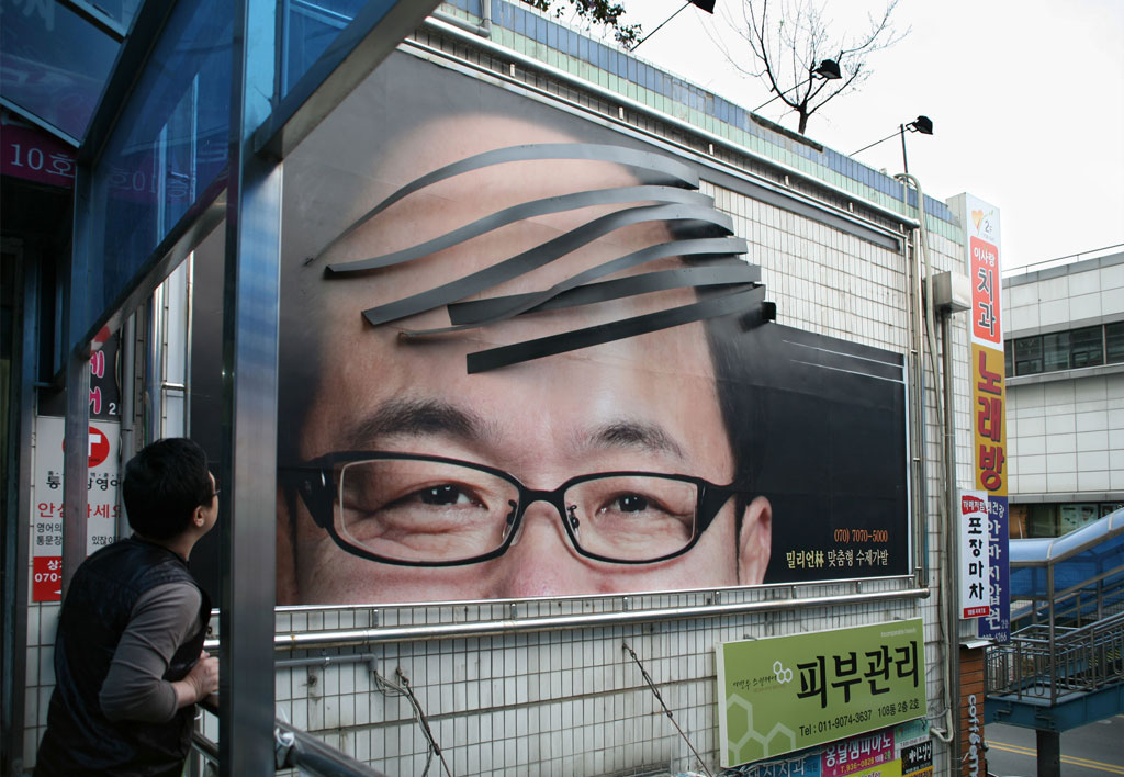
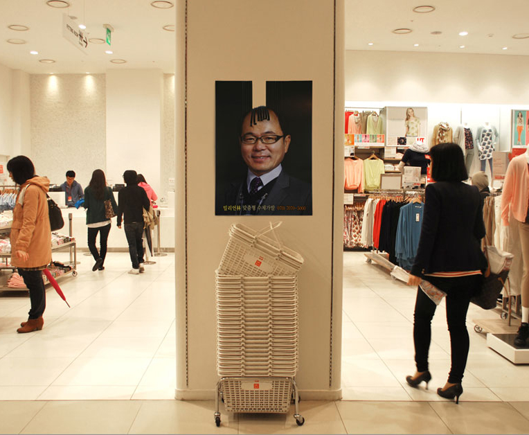
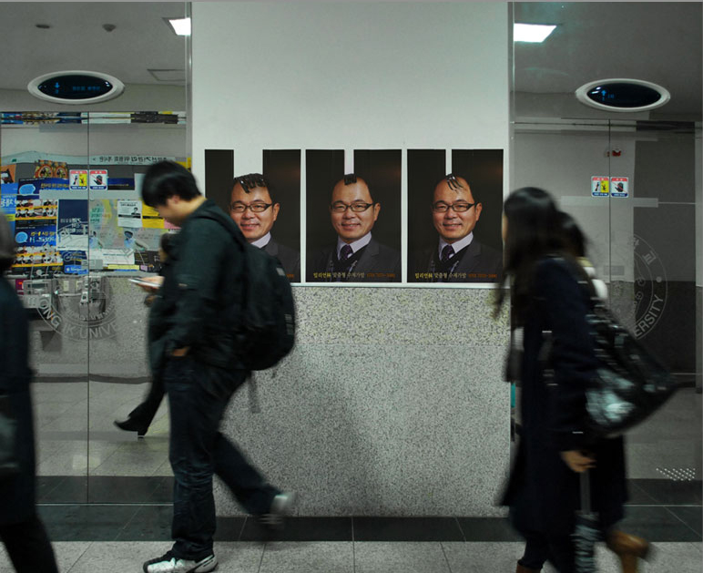
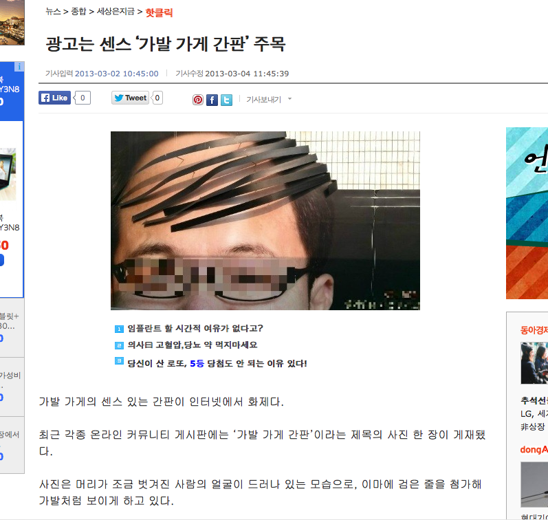
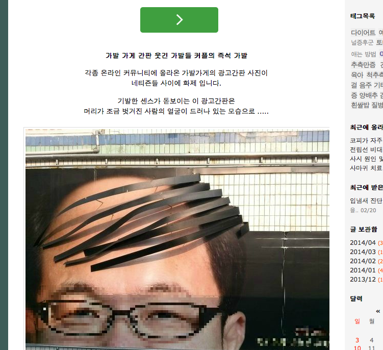
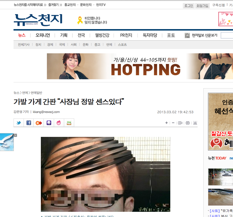
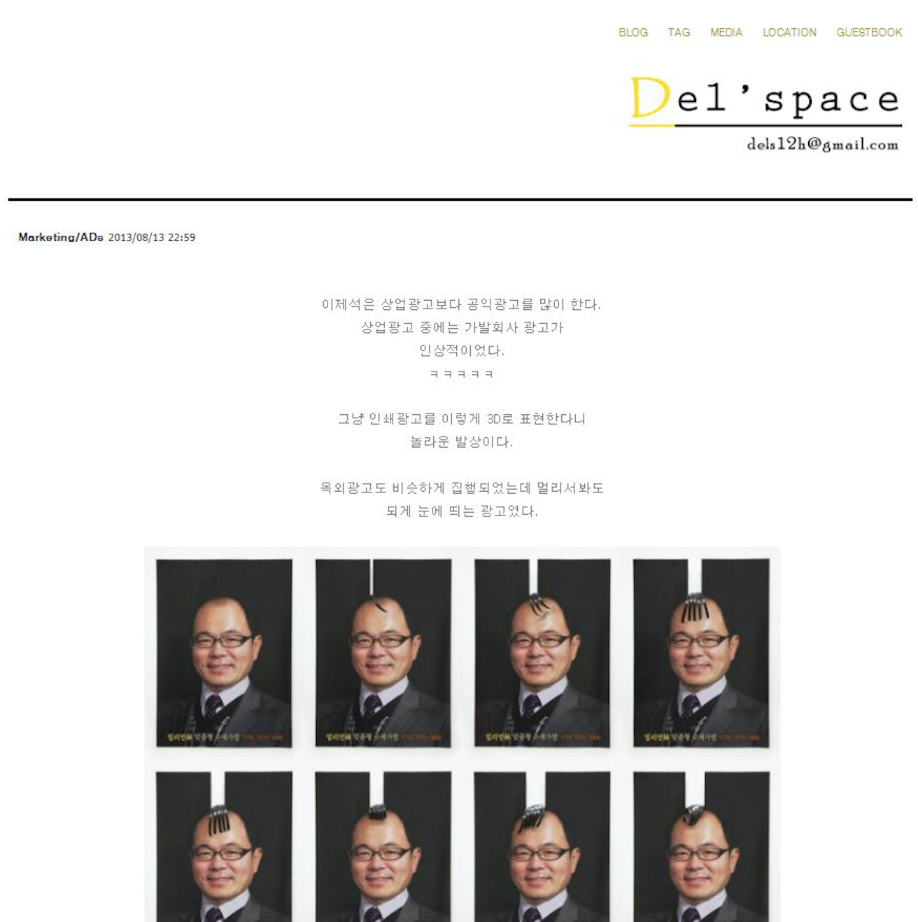
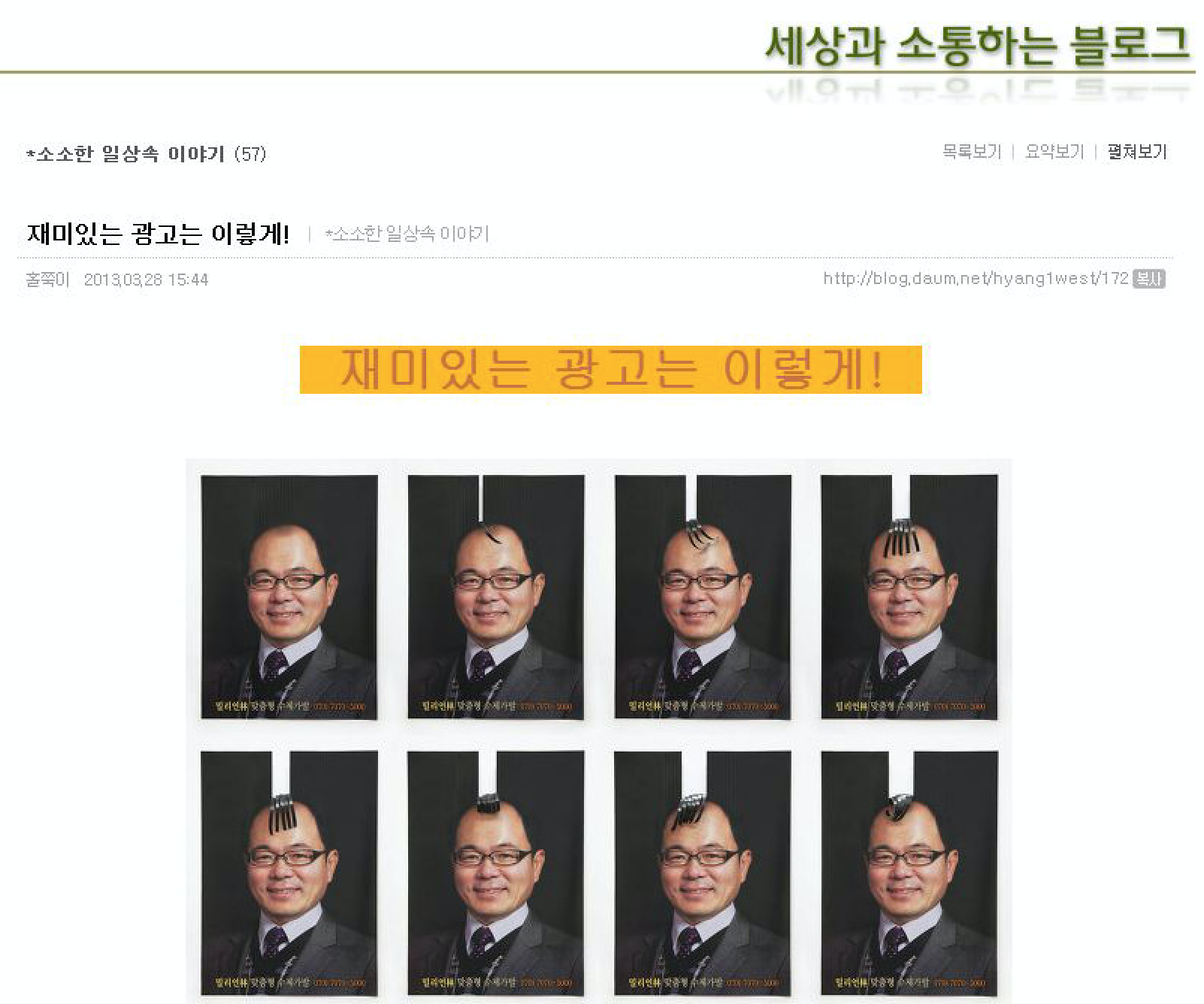
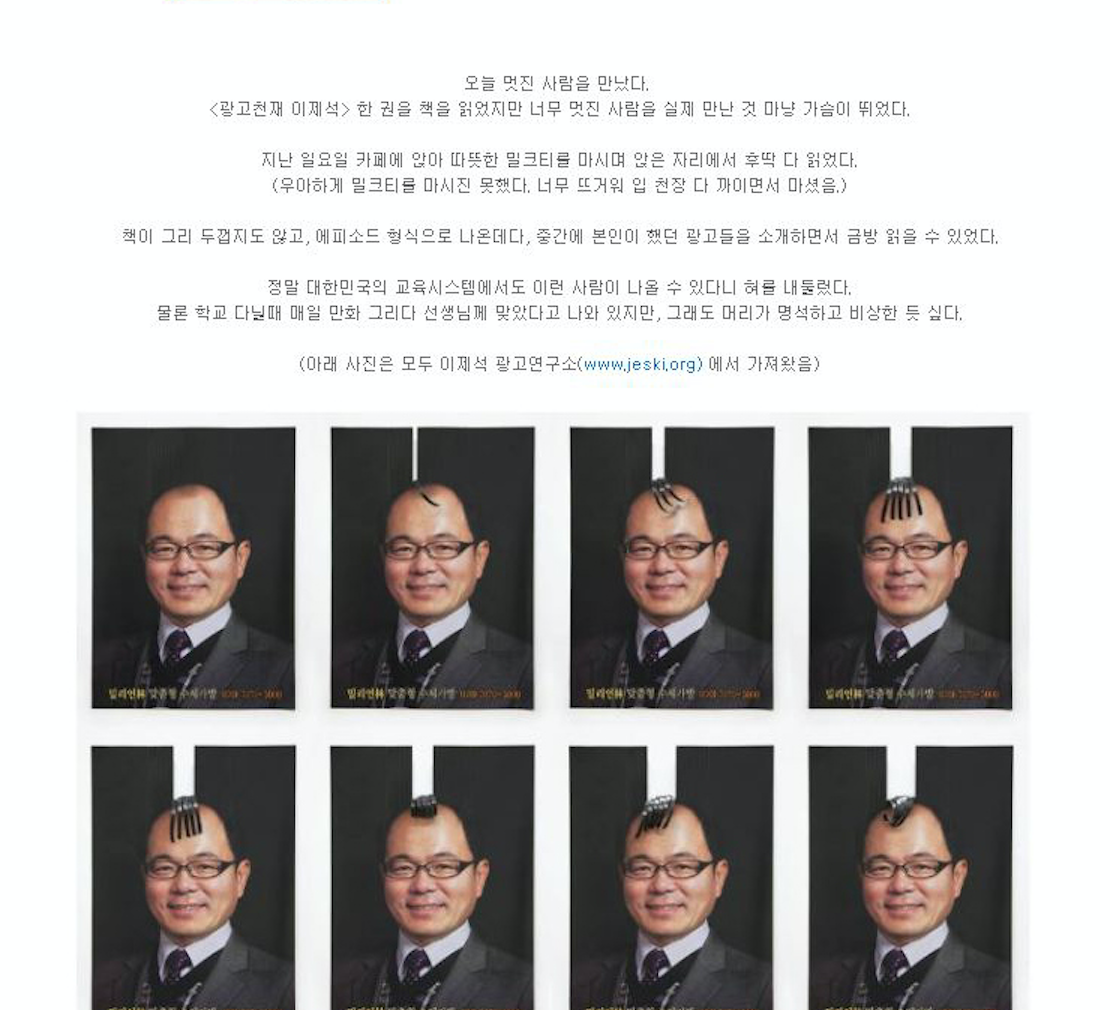
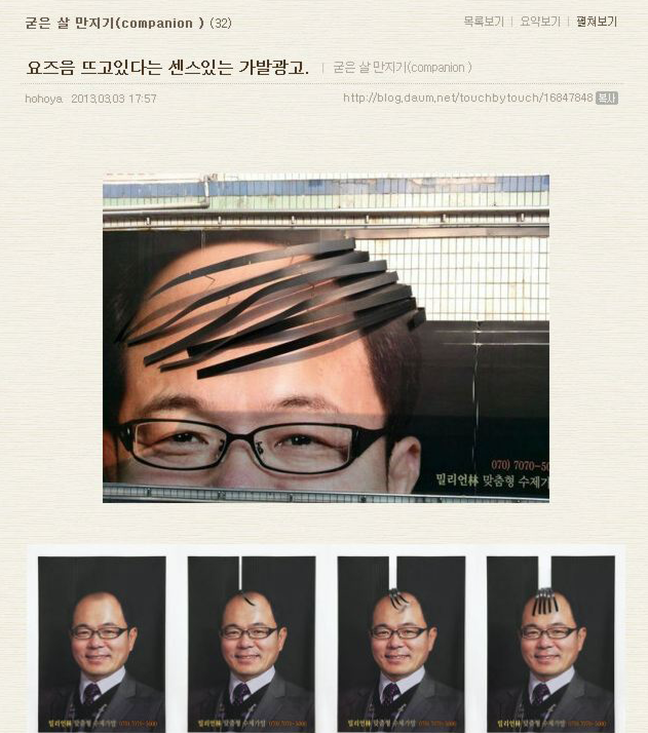
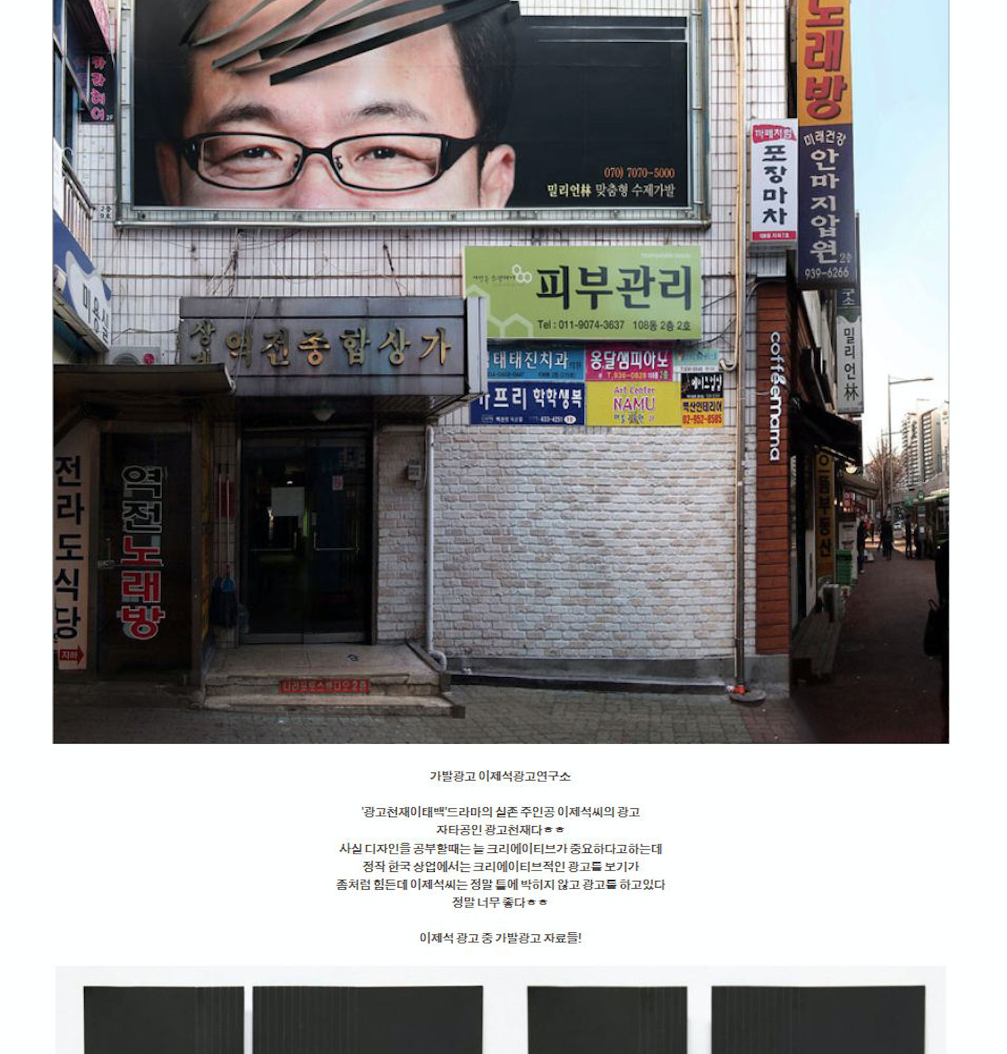
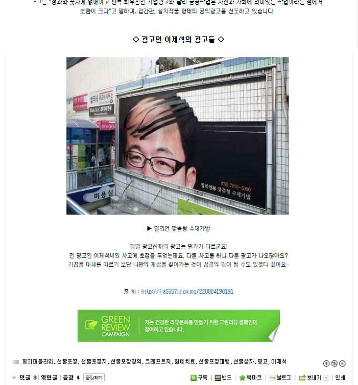
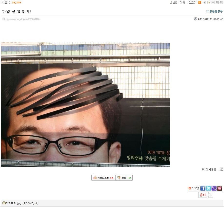
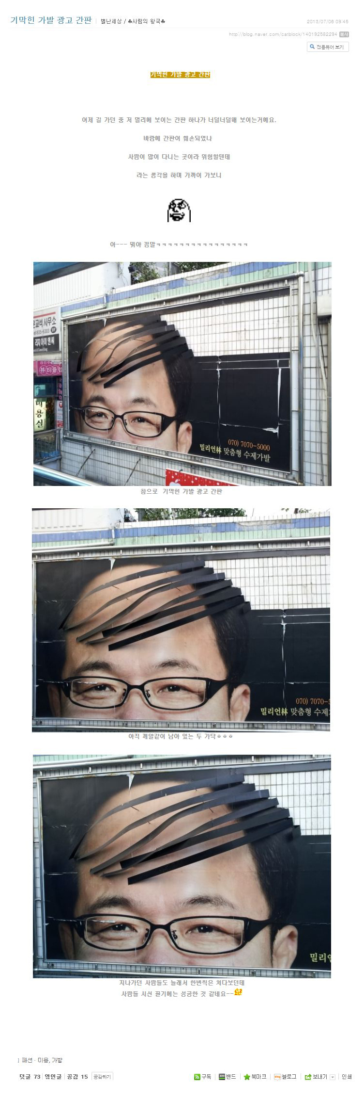
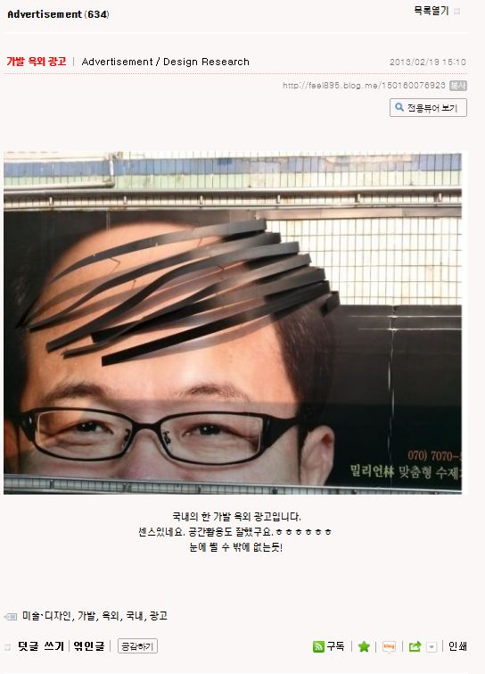
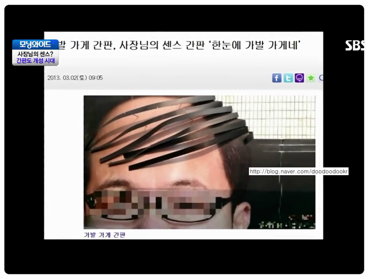
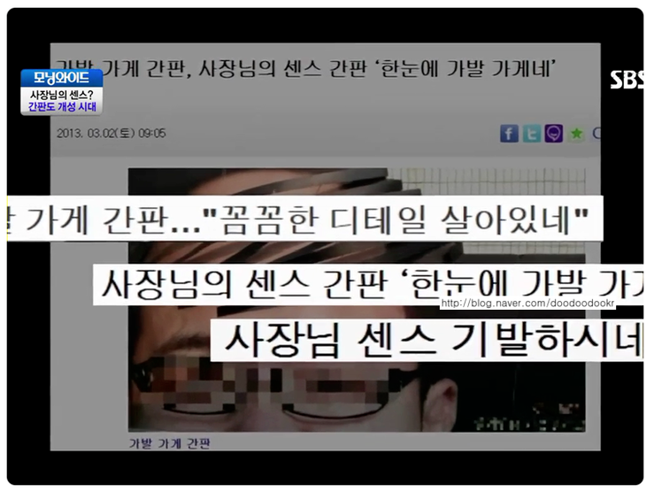
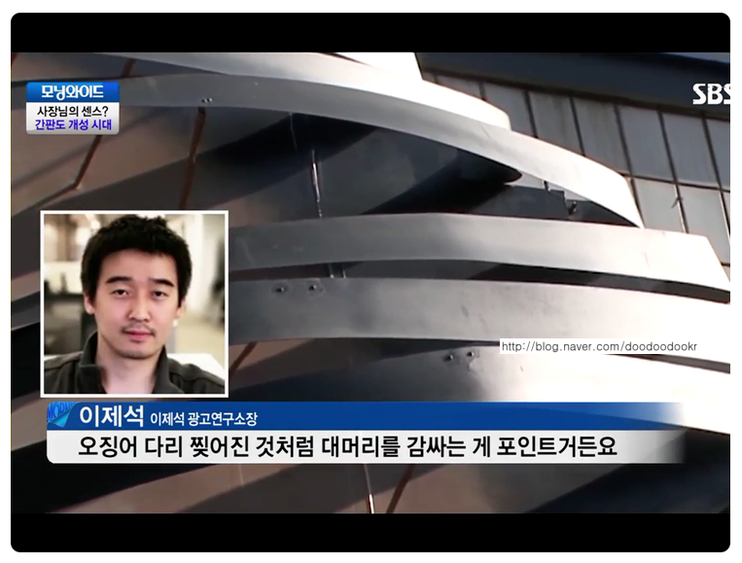
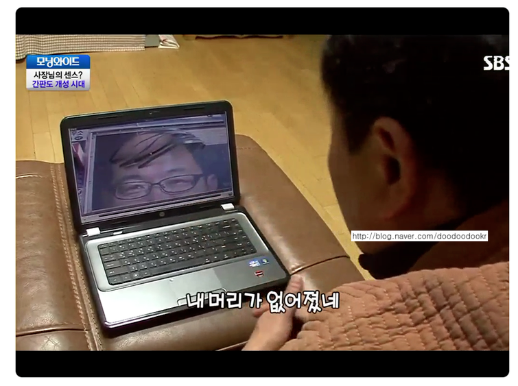
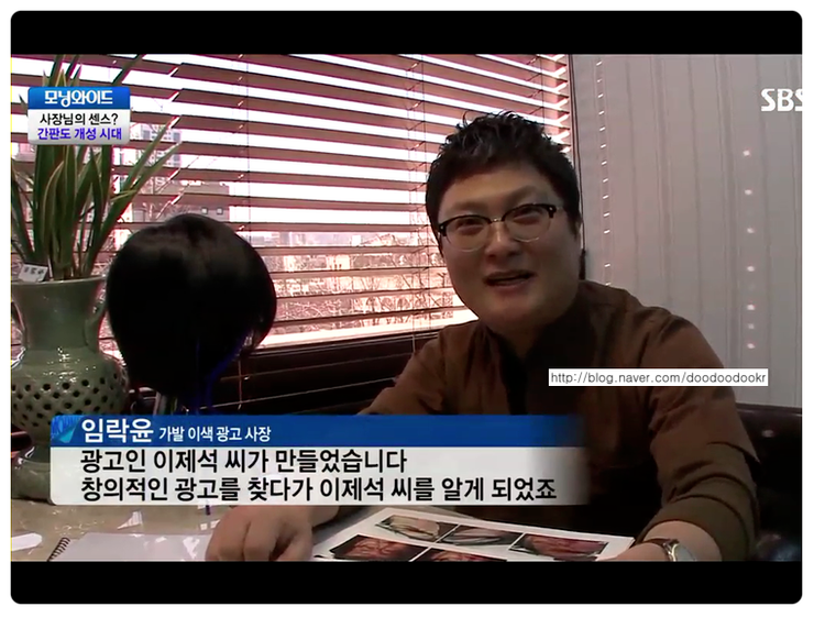
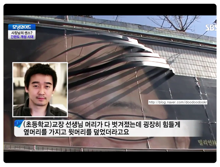
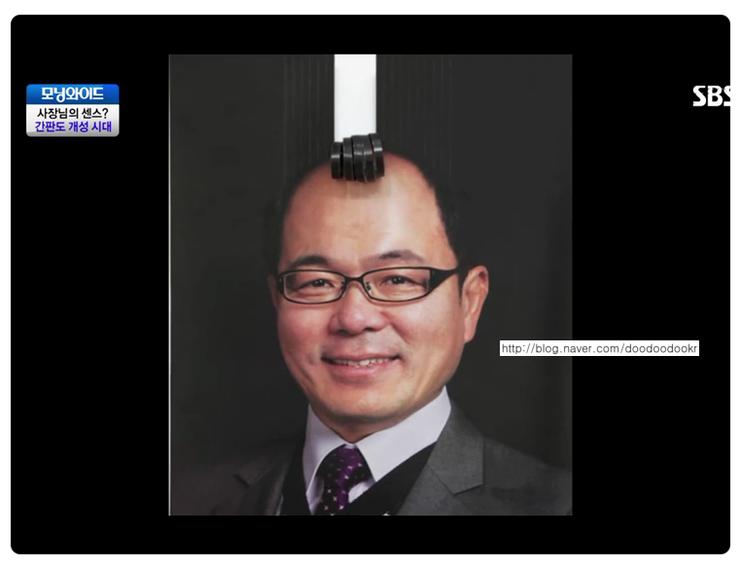
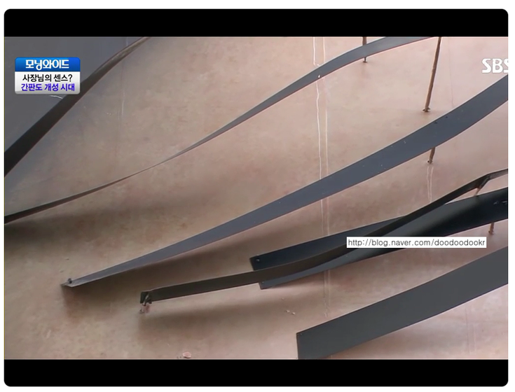
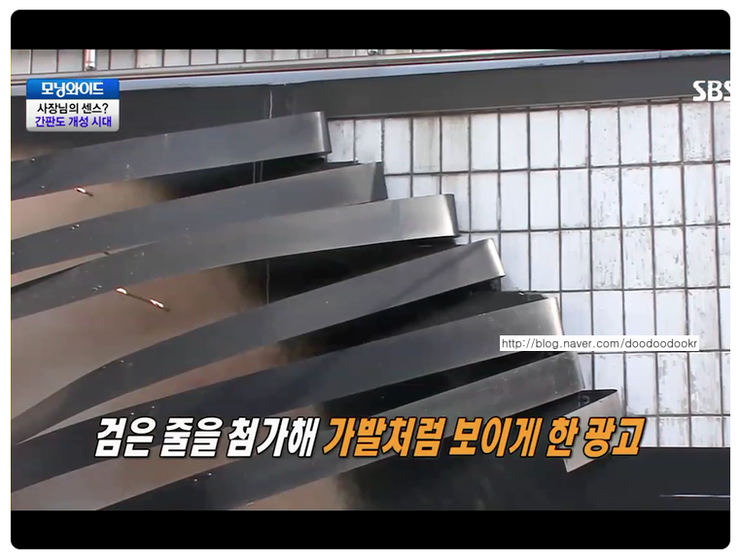
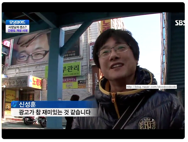
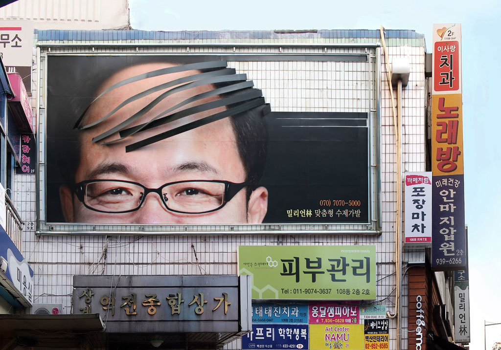
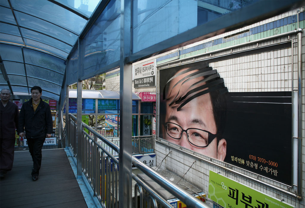
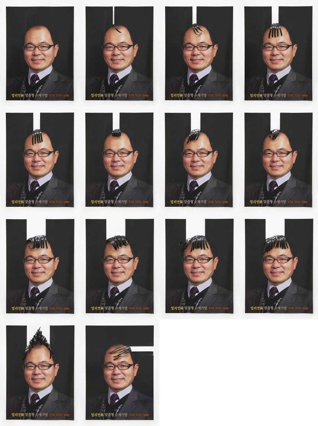
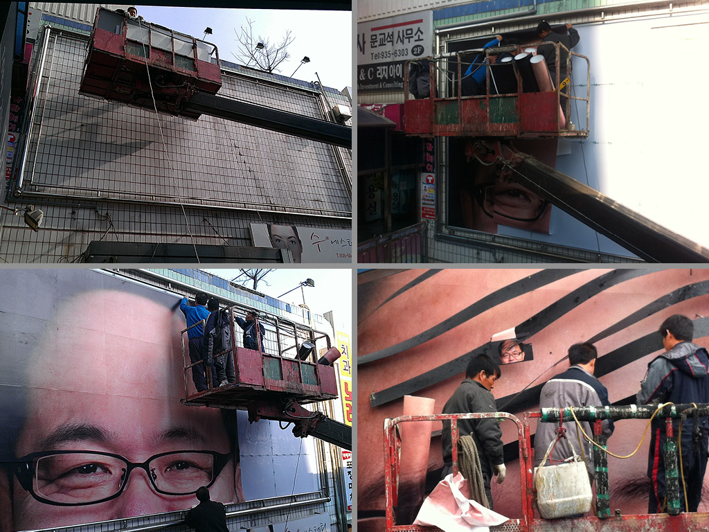
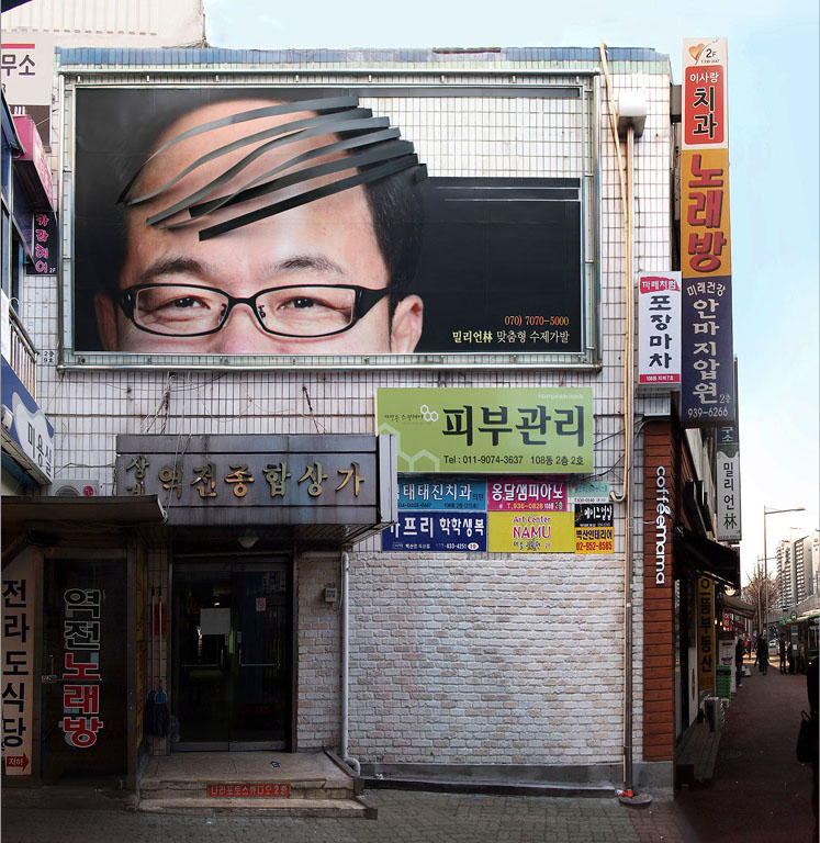
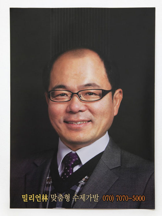
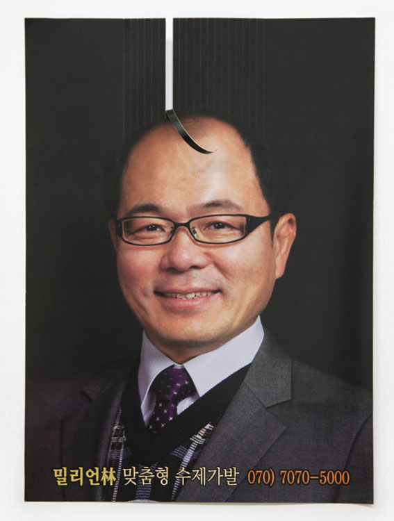
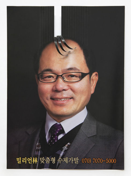
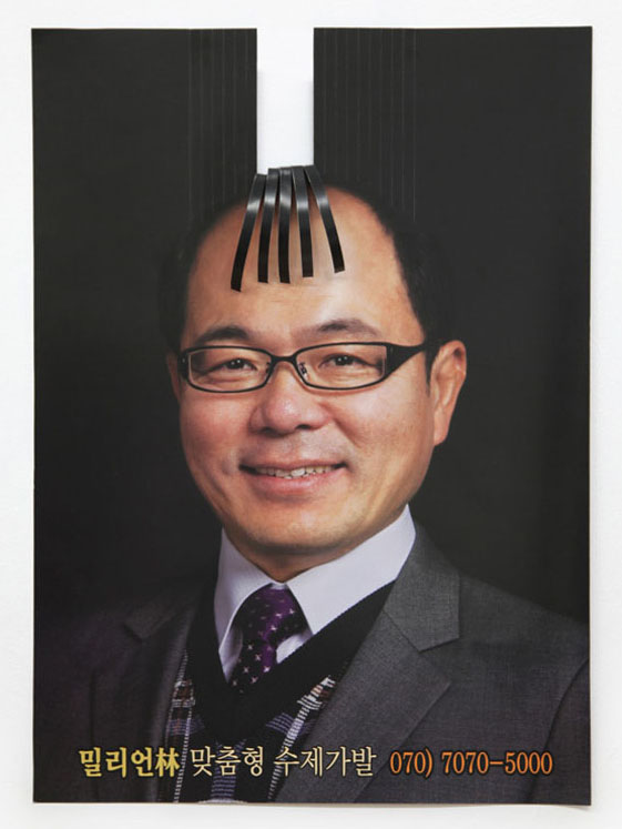
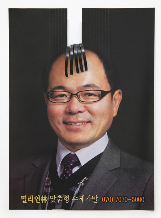
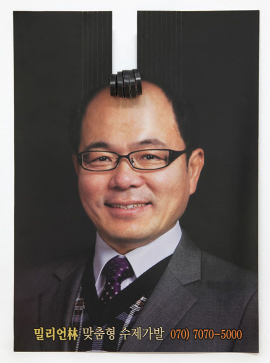
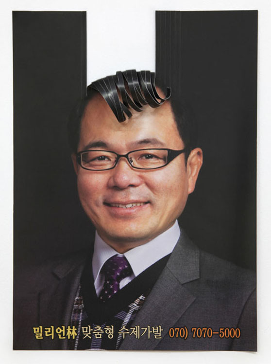
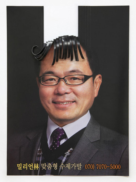
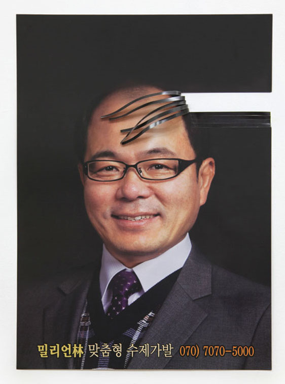
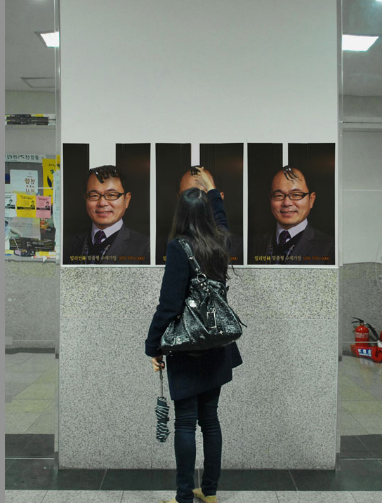
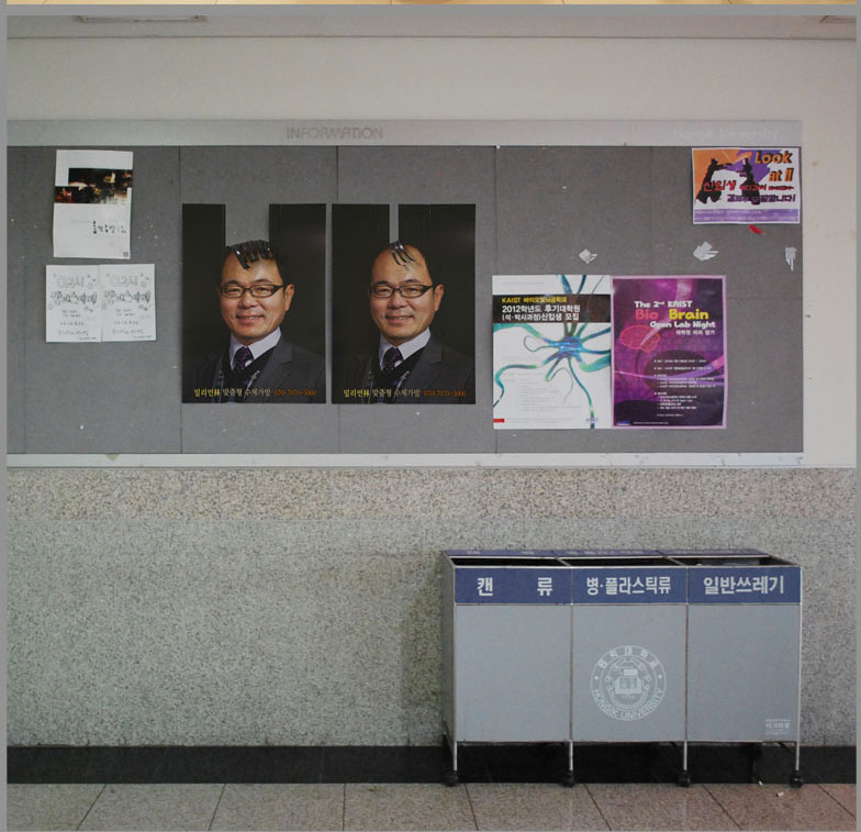
[밀리언림 브랜드 론칭 캠페인: 가장 본질적인 파격] '밀리언림'은 한국의 한 작은 마을에 위치한 소규모 수공예 맞춤형 가발 제작소에서 출발한 가발 전문 제조업체입니다. 최근 대한민국 사회 내 여러 요인으로 탈모 인구가 급증함에 따라, 밀리언림은 새로운 도약의 기회를 맞이하여 창립 이래 최초로 광고 캠페인을 집행하게 되었습니다. 가발이라는 제품 특성상, 이용 고객들은 심리적 수치심으로 인해 자발적인 입소문이나 추천 마케팅을 꺼리는 경향이 강합니다. 따라서 오직 광고를 통한 직접적인 고객 유치가 필수적이라고 판단한 기업 대표는, 무엇보다 광고물 내에서 "브랜드명과 전화번호"가 가장 확실하게 강조되기를 강력히 원했습니다. 이에 이제석 광고연구소는 광고가 지녀야 할 가장 핵심적인 3대 요소인 '상호, 모델(제품), 전화번호'를 제외한 모든 부수적인 시각 요소를 화면 안에서 과감하게 덜어냈습니다. 극도로 절제된 미니멀리즘 속에서도, 인물의 머리 부분을 입체적으로 오려내어 배경과 상황에 따라 다양한 맞춤형 헤어스타일이 자연스럽게 연출되도록 하는 아주 약간의 위트를 가미했습니다. 이 방식은 시각적으로 엄청난 주목도를 이끌어냈습니다. 당시 이러한 심플하면서도 유머러스한 접근은 해당 지역 사회와 가발 업계에서는 매우 파격적이고 전례 없는 시도였습니다. 특히 후속작으로 개발된 포스터들은 고객들에게 물리적인 체험을 선사하도록 기획되었습니다. 관객이 재미 삼아 가발 부분을 직접 만지고, 꼬고, 마는 행동을 유도하도록 입체적으로 디자인된 것입니다. 이러한 인터랙티브한 교감을 통해, 평소 단 한 가지 헤어스타일 외에는 대안이 없어 늘 콤플렉스를 안고 살아가던 탈모인들에게 간접적인 스타일 선택권을 부여했습니다. 결과적으로 이 캠페인은 그들이 마음속 깊이 품고 있던 공허한 심리적 욕구를 위트 있게 대리만족시켜 주었다는 점에서 업계 안팎의 높은 평가를 받았습니다. [Million Lim Brand Launch Campaign: The Radical Power of Radical Simplicity] : "Million Lim" began as a small, artisanal, custom wig workshop in a rural Korean town and has since evolved into a specialized wig manufacturer. As the population suffering from hair loss in South Korea has recently skyrocketed due to various modern societal pressures, Million Lim seized this pivotal moment to pursue larger brand growth, launching the very first advertising campaign since its founding. Due to the sensitive nature of the product, customers often hesitate to rely on word-of-mouth recommendations due to feelings of self-consciousness. Recognizing that direct customer acquisition through targeted advertising was absolutely crucial, the company’s CEO strictly requested that the "brand name and phone number" stand out as the most dominant elements in the creative. In response, the Jeski Social Campaign stripped away every single redundant visual element from the canvas, leaving only the three golden pillars of foundational advertising: the brand name, the model (product), and the contact number. Within this hyper-restricted composition, a subtle touch of wit was injected—die-cutting the head portion of the image to allow a variety of custom hairstyles to naturally form based on what lies behind it. This minimalistic yet clever approach captured immense public attention. At the time, this dead-simple yet humorous execution was considered highly radical and unprecedented within the conservative local market and the traditional wig industry. The follow-up posters were specifically engineered to trigger tactile engagement, inviting people to playfully touch, twist, and style the physical components of the advertisement. Through this interactive connection, the campaign granted a sense of styling autonomy to individuals with hair loss—who often feel trapped with no alternative choices—successfully satisfying their unfulfilled emotional desires and boosting their confidence through creative proxy.
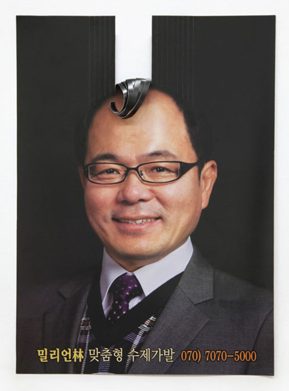 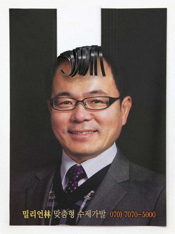
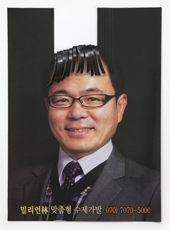 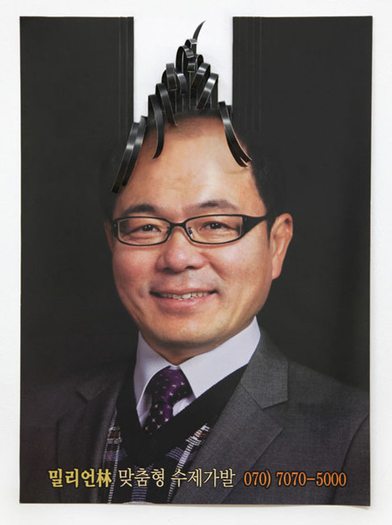
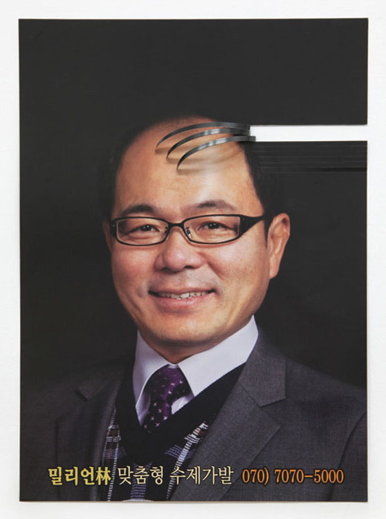 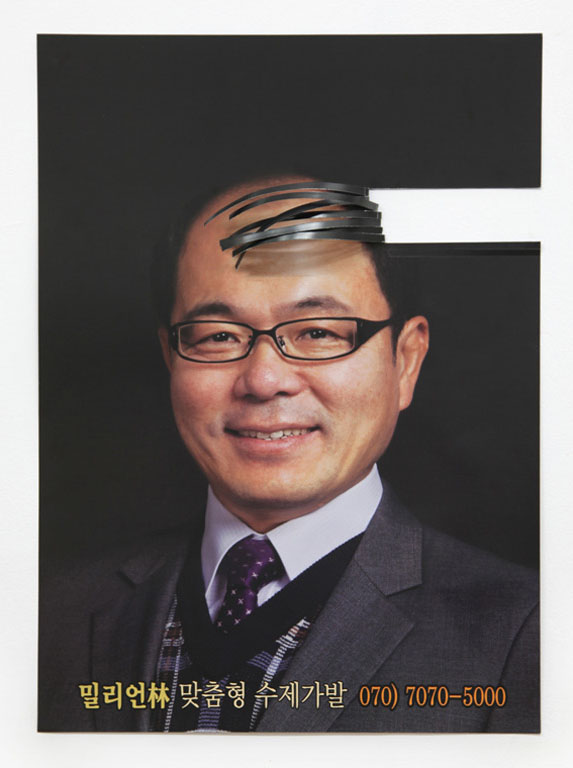
특히 대상층이 많이 존재하는 직장인들 밀집 지역을 중심으로 릴리즈되었으며 대형 슈퍼마켓이나 백화점 같은 상업적인 장소에서부터 일반적인 지하철이나 버스 승강장과 같은 공공장소에 이르기까지 다양한 장소에 부착됐다.
|


| 관리자 로그인 |